Plotting heatmaps from big matrices in R
In genomics, and in many other -omics or big data fields, we often try to plot big matrices. By big matrices, I mean matrices that have more columns and/or rows than pixels in your device. For example, if we have a 50 column-matrix with one line per gene (~20,000 lines), then there are likely more lines in this matrix than pixels in your screen - 1080 vertical pixels in an HD screen (unless you’re reading this in a fancy future of hyper high definition).
The problem with plotting matrix that have more lines than pixels in the screen is precisely that: each pixel will have to represent several values from the matrix. R’s default behaviour in that case might not be optimal for what we intend to show.
An example with numeric data
Let’s start with the generation of some toy data, to mimic what one can obtain with epigenomics data. I’m trying to generate a column-centered signal, which becomes stronger along the rows, while keeping some randomness. I’ll leave the code for reproducibility reasons, but you don’t need to understand this part to understand what comes next:
suppressPackageStartupMessages(library(dplyr))
library(purrr)
Ncol <- 50
genmat <- map(
    1:20000,
    function(i) {
        runif(Ncol) + c(sort(abs(rnorm(50)))[1:25], rev(sort(abs(rnorm(50)))[1:25]))  * i/5000
    }
) %>% do.call(rbind, .)
genmat[1:5, 1:5]
##            [,1]      [,2]      [,3]       [,4]       [,5]
## [1,] 0.15200816 0.7363714 0.2912517 0.39935138 0.06394155
## [2,] 0.86955150 0.5496262 0.9265148 0.47586713 0.11988600
## [3,] 0.03305412 0.3952835 0.6040427 0.06448708 0.38902122
## [4,] 0.96925188 0.2375333 0.7611409 0.65673293 0.01851781
## [5,] 0.80611150 0.7718325 0.2428602 0.50450957 0.77483661
dim(genmat)
## [1] 20000    50
Many R functions can produce a plot from a matrix, such as heatmap(), heatmap.2() or ComplexHeatmap::Heatmap() (or even ggplot2::geom_raster() with some data reshaping). Most of those use the image() function under the hood (it makes a colourful image of the matrix). We will be using mostly this function here.
oldpar <- par(mar = rep(0.2, 4)) # reducing plot margins
image(
    t(genmat), # image() has some weird opinions about how your matrix will be plotted
    axes = FALSE,
    col = colorRampPalette(c("white", "darkorange", "black"))(30), # our colour palette
    breaks = c(seq(0, 3, length.out = 30), 100) # colour-to-value mapping
)
box() # adding a box around the heatmap
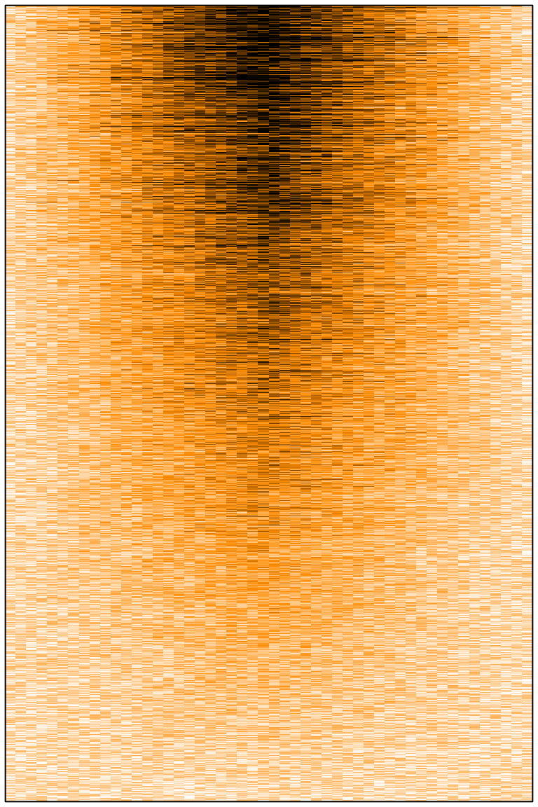
At first one might think that all is well. We can see some signal, at the centre, stronger on top than on the bottom. However, with 20,000 rows in the matrix, the image should have been much less noisy. Here we have 20,000 lines in our matrix, and a few hundred pixels in this png image file. So R must somehow decide how to summarise the values of several cells to draw a single pixel. It seems that R picks only one cell behind the pixel (randomly? or probably the first or the last one) and use this value to fill the entire pixel, leading to strong random downsampling.
A solution could be to make a png file 20,000 pixels high to avoid this downsampling. The resulting file will be a bit too heavy for convenience, and we would need to increase text sizes and margins accordingly.
Some graphical devices (for example pdf() but not png()), will render the image() differently depending on its parameter useRaster (FALSE by default). Putting it to TRUE might help in some situations. According to Wikipedia,
rasterisation is the task of taking an image described in a vector graphics format […] and converting it into a raster image (a series of pixels). The rasterisation algorithm will try to resume several cells of the matrix in a single pixel. Let’s try it:
pdf("../../static/files/big_hm_1.pdf")
layout(matrix(c(1, 2), nrow = 1)) # side by side plot
# Left plot, no rasterisation
image(
    t(genmat),
    axes = FALSE,
    col = colorRampPalette(c("white", "darkorange", "black"))(30),
    breaks = c(seq(0, 3, length.out = 30), 100),
    main = "Original matrix"
)
# Right plot, with rasterisation
image(
    t(genmat),
    axes = FALSE,
    col = colorRampPalette(c("white", "darkorange", "black"))(30),
    breaks = c(seq(0, 3, length.out = 30), 100),
    useRaster = TRUE,
    main = "With rasterisation"
)
dev.off()
## agg_png
##       2
The resulting pdf file is available here (pdf). The results vary greatly depending on the software one use to view the pdf file:
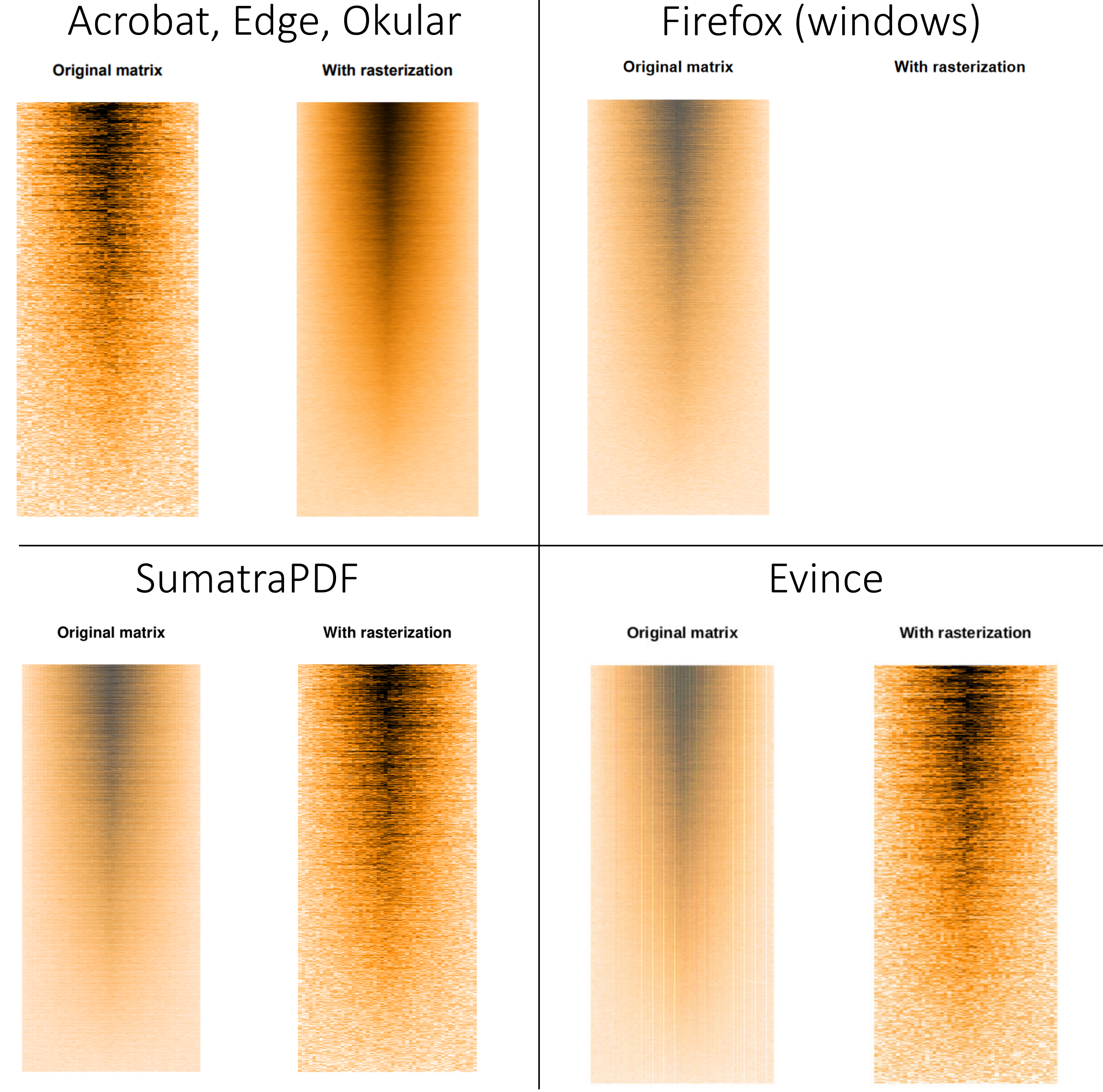
Acrobat, Edge and Okular render the file properly: we can see a much finer representation of the data with rasterisation. Evince and SumatraPDF somehow inverse the rendering, while veiling the non-rastered version. Firefox’s pdf renderer gives up and refuses to render the rasterised image (at least on Windows 10, it does render it properly on GNU/Linux).
While this pdf file weights 5 Mo, running the same code using the svg() device leads to the creation of a 200 Mo svg file! Nonetheless, it seems that rasterisation works well for svg files too.
The rasterisation tries to summarise all the different values behind each pixel by taking their mean. We can do the same process ourselves, with two benefits: we get rid of the variability between the different pdf reader software, and it will work even for non-vector devices such as png, greatly limiting the final weight of the image.
The idea is to reduce the matrix size before making the plot by applying a function (for example, mean()) that will
summarise several cells into one. I’ll suggest this small function (first seen on
canSnippet):
# reduce matrix size, using a summarising function (default, mean)
redim_matrix <- function(
    mat,
    target_height = 100,
    target_width = 100,
    summary_func = function(x) mean(x, na.rm = TRUE),
    output_type = 0.0, #vapply style
    n_core = 1 # parallel processing
    ) {
    if(target_height > nrow(mat) | target_width > ncol(mat)) {
        stop("Input matrix must be bigger than target width and height.")
    }
    seq_height <- round(seq(1, nrow(mat), length.out = target_height + 1))
    seq_width  <- round(seq(1, ncol(mat), length.out = target_width  + 1))
    # complicated way to write a double for loop
    do.call(rbind, parallel::mclapply(seq_len(target_height), function(i) { # i is row
        vapply(seq_len(target_width), function(j) { # j is column
            summary_func(
                mat[
                    seq(seq_height[i], seq_height[i + 1]),
                    seq(seq_width[j] , seq_width[j + 1] )
                    ]
            )
        }, output_type)
    }, mc.cores = n_core))
}
genmatred <- redim_matrix(genmat, target_height = 600, target_width = 50) # 600 is very roughly the pixel height of the image.
genmatred[1:5, 1:5]
##           [,1]      [,2]      [,3]      [,4]      [,5]
## [1,] 0.5010569 0.4997896 0.5000492 0.4954137 0.5165628
## [2,] 0.4924720 0.4724663 0.5530925 0.5654935 0.5138349
## [3,] 0.4947927 0.5672269 0.5300732 0.4804857 0.4854314
## [4,] 0.5457793 0.5994438 0.4980204 0.4352271 0.4360433
## [5,] 0.4449970 0.4621211 0.4678665 0.4902477 0.5137868
dim(genmatred)
## [1] 600  50
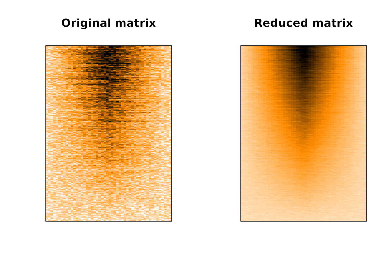
Let’s compare plotting the original matrix (left) with the plot of our reduced matrix.
layout(matrix(c(1, 2), nrow = 1))
# left plot, original matrix
image(
    t(genmat),
    axes = FALSE,
    col = colorRampPalette(c("white", "darkorange", "black"))(30),
    breaks = c(seq(0, 3, length.out = 30), 100),
    main = "Original matrix"
)
box()
# right plot, summarised matrix
image(
    t(genmatred),
    axes = FALSE,
    col = colorRampPalette(c("white", "darkorange", "black"))(30),
    breaks = c(seq(0, 3, length.out = 30), 100),
    main = "Reduced matrix"
)
box()
par(oldpar) # restoring margin size to default values
Much better! Paradoxically, we can better grasp the complexity of the data by summarising it before plotting it, instead of letting R handle poorly the overplotting issue!
Sparse matrix
In some cases, taking the average values might not be the best way to represent our data. For example, if the matrix is sparse, we might not want to scale down the few isolated values with all those surrounding zeroes. Instead, taking the maximal value might lead to a more informative representation.
I encountered this case while working on eQTL (a QTL study were the phenotype is the level of expression of a gene). The aim is to identify Single Nucleotide Polymorphisms (SNP) that are associated with changes in gene expression level in a tissue. A statistical test is done for each SNP and each expressed gene, resulting in many p-values.
In this case, we had roughly 20,000 expressed genes and 45,000 SNP, resulting in a 20,000 x 45,000
matrix of p-values. Most of the p-values are not significant, with only a minority being very small
(or big after -log10(p-value) transformation). What we want to visualise is the best p-values
corresponding to the lead SNP. So we are going to reduce the matrix by taking the max() of the
-log10(p-values) instead of their mean():
# left matrix, we take the mean of the -log10 of the p-values
redim_matrix(
  eqtls,
  target_height = 600, target_width = 600,
  summary_func = function(x) mean(x, na.rm = TRUE),
  n_core = 14
)
# right matrix we take the maximum of the -log10 of the p-values
redim_matrix(
  eqtls,
  target_height = 600, target_width = 600,
  summary_func = function(x) max(x, na.rm = TRUE),
  n_core = 14
)
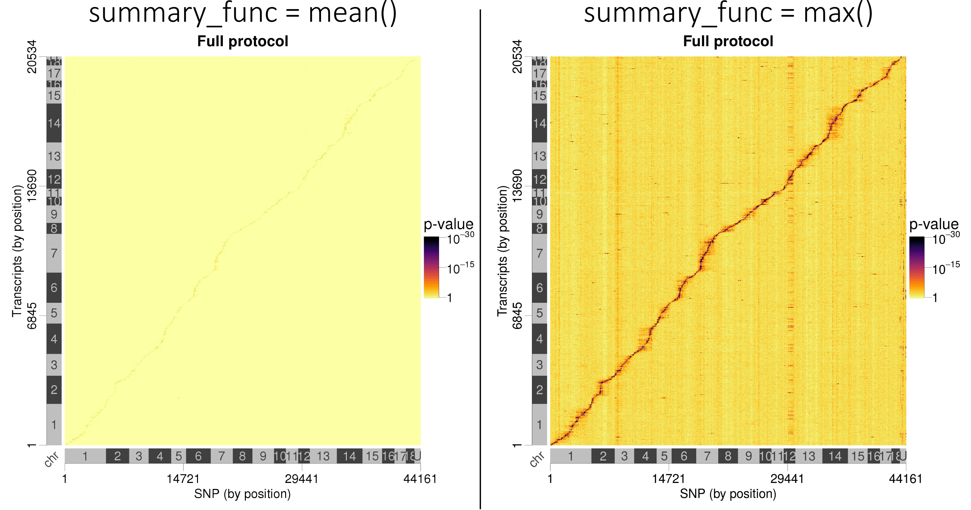
Lead SNP p-values are better visualised when taking the best p-values instead of averaging them.
I should mention that without reducing the matrix size before the plot, R refuses to render because of memory saturation.
Categorical data
For categorical data, we cannot take the average of values within a pixel, we rather need to average the colours themselves.
I do it bellow on the RGB space, but it might be better to do it on the fancy HCL space ?
Instead of image() we need to use the rasterImage() function to do the plotting.
# some toy data
mycolors <- matrix(c(
  sample(c("#0000FFFF", "#FFFFFFFF", "#FF0000FF"), size = 5000, replace = TRUE, prob = c(2, 1, 1)),
  sample(c("#0000FFFF", "#FFFFFFFF", "#FF0000FF"), size = 5000, replace = TRUE, prob = c(1, 2, 1)),
  sample(c("#0000FFFF", "#FFFFFFFF", "#FF0000FF"), size = 5000, replace = TRUE, prob = c(1, 1, 2))
), ncol = 1)
color_mat <- t(as.matrix(mycolors))
# custom function to average HTML colours
mean_color <- function(mycolors) {
    R     <- strtoi(x = substr(mycolors,2,3), base = 16)
    G     <- strtoi(x = substr(mycolors,4,5), base = 16)
    B     <- strtoi(x = substr(mycolors,6,7), base = 16)
    alpha <- strtoi(x = substr(mycolors,8,9), base = 16)
    return(
        rgb(
            red   = round(mean(R)),
            green = round(mean(G)),
            blue  = round(mean(B)),
            alpha = round(mean(alpha)),
            maxColorValue = 255
        )
    )
}
# Let's apply the redim_matrix() function using our newly defined mean_color() function:
color_mat_red <- redim_matrix(
  color_mat,
  target_height = 1,
  target_width = 500,
  summary_func = mean_color,
  output_type = "string"
)
# And do the plotting
layout(matrix(c(1, 2), nrow = 2))
# left plot, original matrix
plot(c(0,1), c(0,1), axes = FALSE, type = "n",  xlab = "", ylab = "", xlim = c(0, 1), ylim = c(0,1), xaxs="i", yaxs="i", main = "Full matrix")
rasterImage(
    color_mat,
    xleft   = 0,
    xright  = 1,
    ybottom = 0,
    ytop    = 1
)
box()
# right plot, summarised matrix
plot(c(0,1), c(0,1), axes = FALSE, type = "n",  xlab = "", ylab = "", xlim = c(0, 1), ylim = c(0,1), xaxs="i", yaxs="i", main = "Reduced matrix")
rasterImage(
    color_mat_red,
    xleft   = 0,
    xright  = 1,
    ybottom = 0,
    ytop    = 1
)
box()
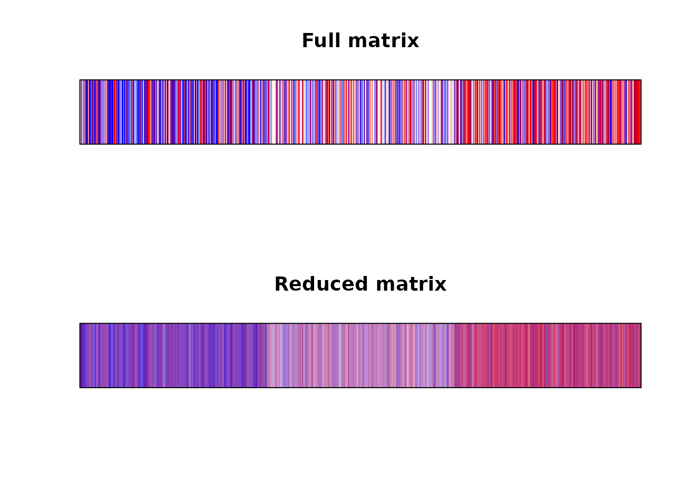
Again, the plot looks much better when we solved the overplotting issue ourselves.
ggplot2
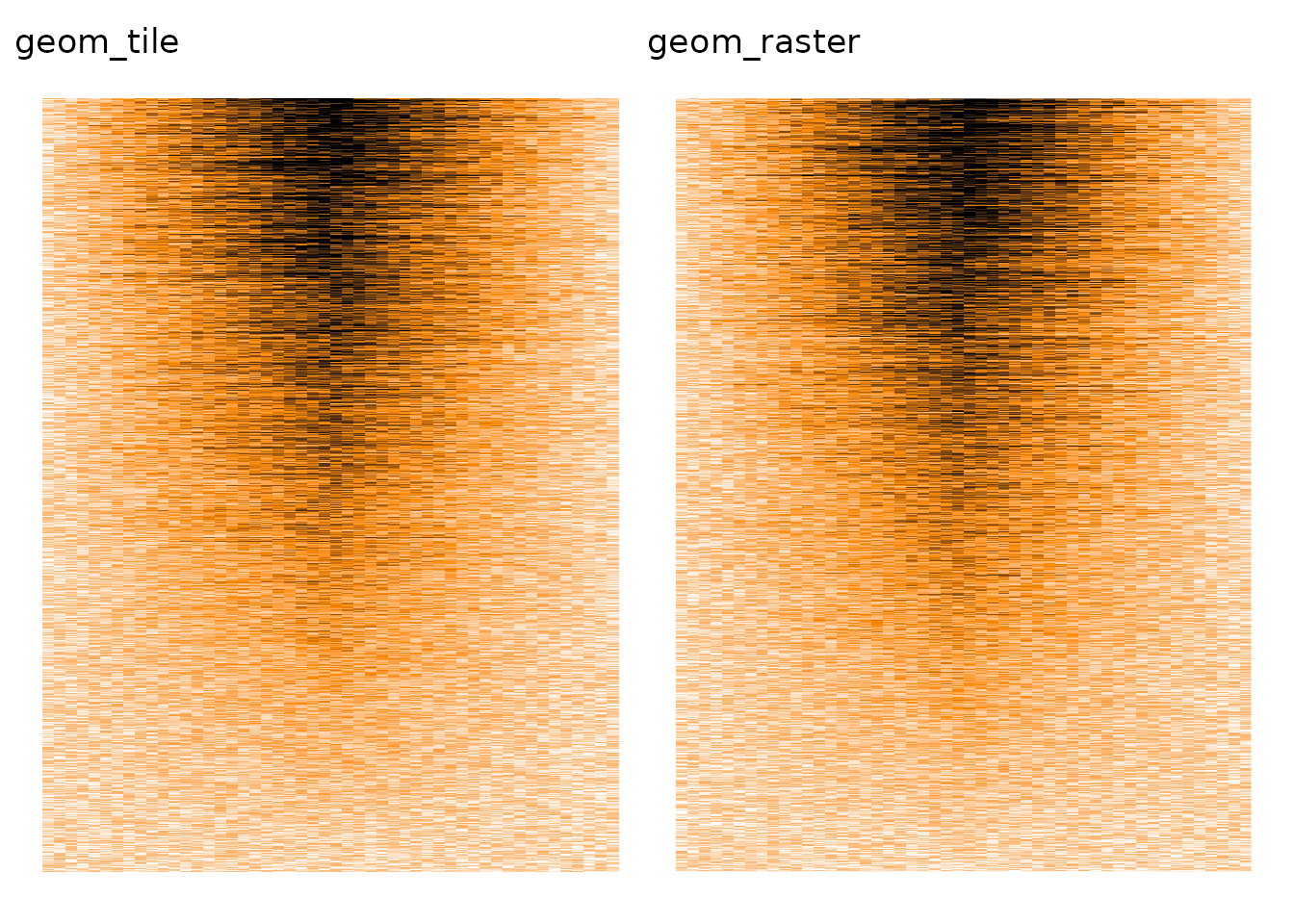
As far as I can tell, ggplot2 is also affected by the overplotting issue, from both geom_tile() and geom_raster (an optimised geom_tile() when all tiles have the same size).
library(ggplot2)
library(patchwork)
# Wide to long transformation
data_for_ggplot <- as.data.frame(genmat) %>%
    mutate(row = rownames(.)) %>%
    tidyr::pivot_longer(-row, names_to = "col") %>%
    mutate(row = as.numeric(row), col = readr::parse_number(col))

# with geom_tile()
p1 <- ggplot(data_for_ggplot, aes(x = col, y = row, fill = value)) +
  geom_tile() +
  scale_fill_gradient2(
      low = "white", mid = "darkorange", high = "black",
      limits = c(0, 3), midpoint = 1.5, oob = scales::squish
  ) +
  labs(title = "geom_tile") +
  theme_void() +
  theme(legend.position = "none")
# with geom_raster()
p2 <- ggplot(data_for_ggplot, aes(x = col, y = row, fill = value)) +
  geom_raster() +
  scale_fill_gradient2(
      low = "white", mid = "darkorange", high = "black",
      limits = c(0, 3), midpoint = 1.5, oob = scales::squish
  ) +
  labs(title = "geom_raster") +
  theme_void() +
  theme(legend.position = "none")
p1 + p2
ComplexHeatmap
ComplexHeatmap is a fantastic Bioconductor package to plot advanced heatmap with annotations everywhere.
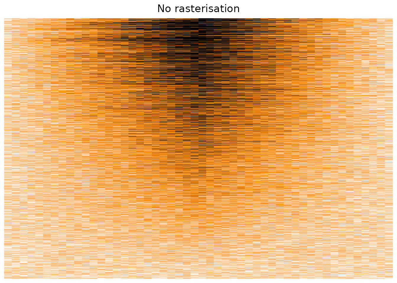
Plotting our original matrix suggest that the package suffers from the same overplotting issue, displaying only a sub-sample of the cells, instead of taking the average value on a per-pixel basis.
suppressPackageStartupMessages(library(ComplexHeatmap))
Heatmap(
  genmat[nrow(genmat):1, ], # putting the top on top
  col = circlize::colorRamp2(c(0, 1.5, 3), c("white", "darkorange", "black")), # our colour palette
  cluster_rows = FALSE, cluster_columns = FALSE,
  show_heatmap_legend = FALSE,
  column_title = "No rasterisation",
  use_raster = FALSE
)
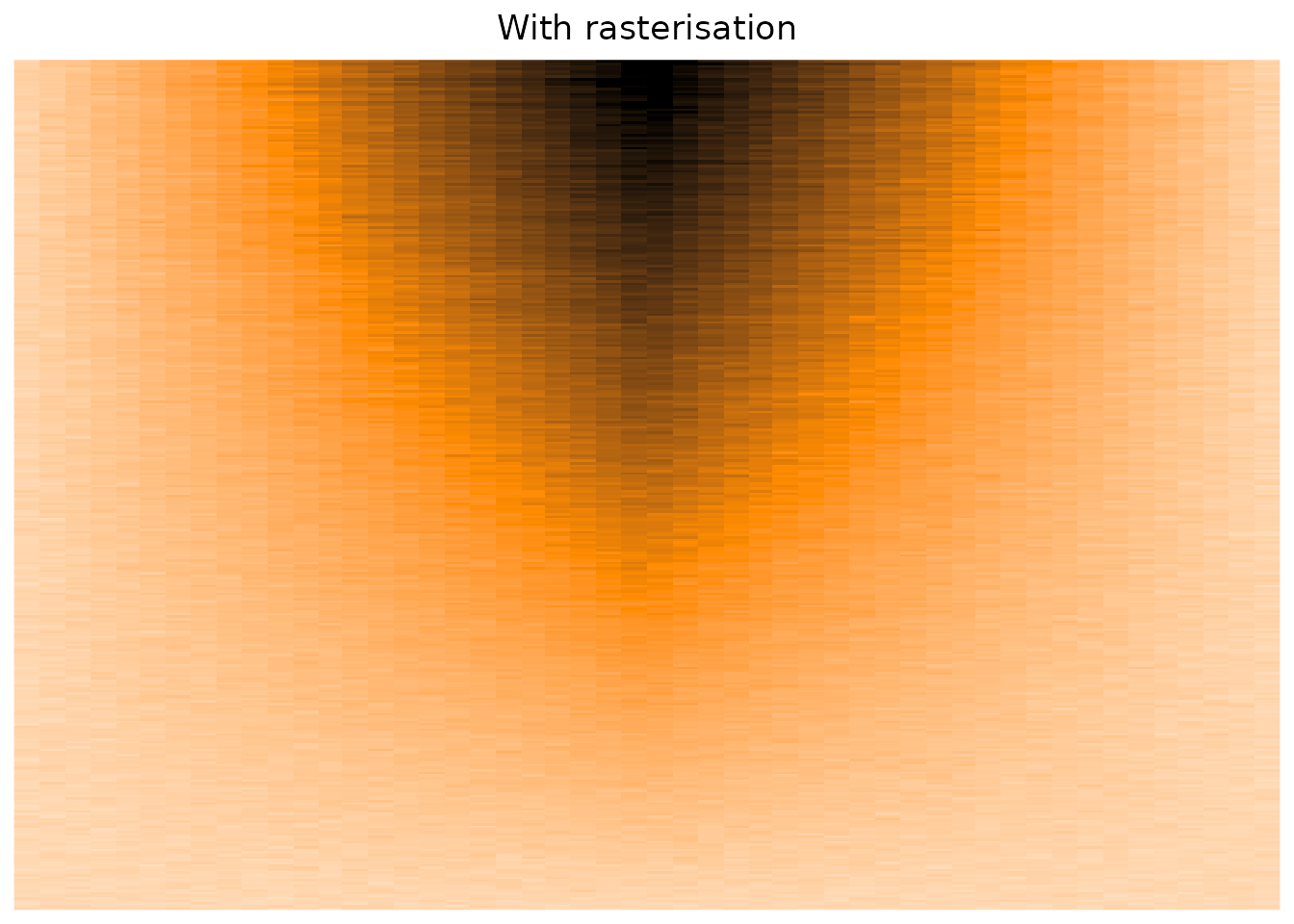
The Heatmap() function does have some parameters that suggest using rasterisation in cases of big matrices,
but as far as I can tell, I see no difference concerning the overplotting issue.
which now works well! (see the post-scriptum of this post)
Heatmap(
  genmat[nrow(genmat):1, ],
  col = circlize::colorRamp2(c(0, 1.5, 3), c("white", "darkorange", "black")),
  cluster_rows = FALSE, cluster_columns = FALSE,
  show_heatmap_legend = FALSE,
  use_raster = TRUE,
  raster_resize = TRUE, raster_device = "png",
  column_title = "With rasterisation"
)
Conclusion
In R, reduce your big matrices before plotting them to better see the small details. Else you will have a sub-optimal plots.
The main issue with this process is that you will have to manage manually the decorations (axes, side colour bars, dendrograms, etc.), which is laborious.
Thanks to Mathurin, Kumquat and lhtd for proofreading. A French version of this post was published one week early on the blog bioinfo-fr.net.
Post scriptum
Zuguang Gu, the author of ComplexHeatmap, has since implemented a smart rasterisation method for ComplexHeatmap. Instead of reducing the matrix, ComplexHeatmap will first produce a giant png of the heatmap part, reduce it with {magick}, and then embed the reduce matrix with the annotations and decorations in the final plot. Read his blog post!